Thursday, April 25, 2013

How to Slow Down your Mouse Pointer

Quite frankly, this post shouldn't even exist. Every operating system, except some recent Linux flavors, has always had a mouse speed option so that you can speed up or slow down your mouse. However, the recent KDE's (and from reading a bunch of forum posts, it looks like Gnome may also be affected) do not have this option.

Instead there is an option for "Mouse Acceleration" in the KDE Control Panel. As I understand it, once your mouse moves more than a certain number of pixels (which is also adjustable), the acceleration kicks in and speeds up the mouse. The idea is that normally, your mouse moves at a 1-to-1 ratio, which is usually too slow for large screens, but it is good for clicking on icons, selecting text, and other fine detail work. Once your mouse moves more than the threshold number of pixels, acceleration kicks in and now it moves at a faster 2-to-1  ratio (or whatever you set it to) and you can quickly move from one side of the screen to the other.

But since there is no velocity (or speed or resolution) control, if your mouse doesn't move at the right speed in the 1-to-1 mode, what you have to do is turn the threshold down to 1 pixel (so it's always on) and then adjust the acceleration. The problem is that if you have a high DPI mouse (mine is 5700dpi), KDE will let you set an acceleration down to a 0.1-to-1 ratio, but the setting has no effect whatsoever.

There are quite a few forums posts out there with "solutions" that don't work. One involves modifying xorg.conf, which doesn't even exist on most systems anymore thanks to auto-detection and it requires root permissions. But even so, I couldn't make it work. Another suggestion is to use xset, but again, I made no headway.

The solution is to use xinput. Open up a console and just run xinput with no options:

xinput

You'll see a list of all of the input devices on your system, along with their ID's. My mouse showed up with two different ID's, so if this happens to you, here's how to figure out which one to change. Execute the following for each ID:

xinput set-prop ID 'Evdev Axes Swap' 1

where ID is the numeric ID you want to try. Move the mouse after each time you run the command. When pushing the mouse up makes the pointer move left, you've found the right one. Reset the axes swap using:

xinput set-prop ID 'Evdev Axes Swap' 0

Now, you need to set the deceleration. Do this with:

xinput set-prop ID 'Device Accel Constant Deceleration' N.N

where N.N is the slowdown to apply. 1.0 is the minimum (fastest) and you can go as large as you like. For me, 1.5 was just about perfect. Try several values until you find one that you like.

Finally, you need to make sure this command runs every time you log in, so add it to the end of ~/.profile . Note that this will only run after you log in, so if you use a log in screen, the mouse pointer speed will be unaffected there.

Thursday, March 21, 2013

Quick Fix: Bad Codepage

I just tried to plug my digital camera into my computer and when I did, Dolphin gave me a cryptic error message:
mount: wrong fs type, bad option, bad superblock on /dev/sdb1, missing codepage or helper program, or other error. In some cases useful info is found in syslog - try dmesg | tail or so
Considering that I've used this camera with the computer plenty of times before, I assumed that this error message meant that the flash card was corrupted. I did an fdisk, but it didn't find anything wrong. Doing a "dmesg | tail", as the message suggested, gave me:
FAT-fs (sdb1): codepage cp437 not found
Codepages are part of the kernel, so this was actually the hint I needed. The problem was that the kernel had been updated, but the system hadn't been rebooted. After a quick reboot, the problem went away.

The lesson is that even in Linux, sometimes a good, clean restart is all that's needed to fix a problem.

Monday, March 18, 2013

Making a Narrated LibreOffice Impress (PowerPoint) Video using Linux

In my work, PowerPoint presentations are used a lot and recently, the trend recently has been to re-distribute these presentations as videos with audio narration so that others may watch it later. Some of the videos are of particularly poor quality with the audio and video coming from a camcorder pointed at the screen during the live presentation. I'm going to show you how to make a quality video using only LibreOffice Impress, FFmpeg, and KSnapshot.

These videos are handy for work, for creating video reviews for Newegg, and for creating how-to videos for YouTube. Especially since LibreOffice presentations can contain images, animations, and videos, you can really create some amazingly useful videos with this technique.

From a hardware side, you will need a decent microphone, of course. And if you have a multi-monitor setup it will make things easier during the recording of the video, but it's in no way necessary. The broad steps are:
  • Create the presentation.
  • Record it.
  • Clean it up and publish it.
So lets get started.


1. Get the tools.

Most openSUSE distributions will likely already include the tools you'll need. But as a double-check, execute from the commandline:
sudo zypper in libreoffice-impress ffmpeg ksnapshot kmix
KSnapshot and KMix only apply if you're using KDE. If you're using another desktop environment, then just make sure you have an audio mixer (or volume control) and a tool that can take screenshots.


2. Create the slides.
I won't go into any great detail about creating the slides other than to say that you should try and consider all of your users' needs. Some people might be watching on a cellphone, so keep the fonts and images big and legible. Some people might be hard-of-hearing, so make sure that the slides are at least somewhat self-descriptive. And some people might be color blind or have low vision, so use a high contrast color scheme. By taking your users' needs into account, you'll make your video more accessible and by extension, more useful.


3. Create the narration.

In Impress, there is a Notes tab above your slide. Here you can enter in a script to read during each slide. If you have a multi-monitor setup, then you can have the presentation on one screen for recording and your notes on the other. If you don't, then you can print out the notes (under Print, change Print Slides to Print Notes). Having a script will reduce the number of "ums" and "uhs", keep you on track, increase the professionalism of the video, and ultimately reduce the length, since you're not trying to remember what to say next.


4. Recording the video.
It's time to record the actual video. First, make sure that your hardware is ready. From an audio standpoint, you'll need to test out your microphone. The easiest way to do this is to use an existing audio program on your computer. I use Audacity for this and Skype works too. You can also find Flash websites online that will let you test your mic.

If your mic is part of a headset, then the boom should be to the side of your mouth. Putting it in front will make your breathing audible.

In KMix, adjust the microphone volume under Capture Devices. It should be approximately halfway. A program like Audacity is great for audio testing because it lets you see the waveform and you can see if your audio is clipping (because it is too loud).

Once you have your audio setup, get the room ready. You want to minimize all noise. Most microphones are very sensitive to external noises such as a TV on in the next room, your air conditioning, the neighbor's dog, etc. Sometimes you just can't record when you want to and you have to wait until everything else is quiet.

Recording the video with FFmpeg is really simple:
ffmpeg -f alsa -ac 1 -i default -f x11grab -r 20 -i :0.0 -sameq Original.mpg
Once you're done recording, press q to stop.

The -f switch says to record audio from Alsa. -ac sets the audio to one channel (mono). -i says to use the default audio source.

The second -f switch says to record video from x11 (i.e., your desktop). -r sets the frame rate; you don't need full motion video for a presentation, so slightly lower is okay. If you want, you can set this to 30, but the file size will be larger. -i sets the x11 desktop to record. -sameq sets the quantizer. If you have a multi-monitor setup like me, then you'll need a more complicated ffmpeg commandline. My monitor setup looks like this:


If I want to record from the second monitor, then I want to record a 1280x1024 window that has its origin at (1920,56). The FFmpeg command to do this is:
ffmpeg -f alsa -ac 1 -i default -f x11grab -s 1280x1024 -r 20 -i :0.0+1920,56 -sameq Original.mpg
Once you start recording, start the slide show (F5) and go through the slides. Once you are done, press q in the FFmpeg terminal to end the recording. Don't worry if you recorded a few seconds of getting ready at the beginning; getting rid of the garbage at the ends of the of video is the next step.


5. Trimming the video.

When you went to record the video, you captured a few seconds of junk at the beginning and at the end (you know, where you were making the presentation fullscreen and getting ready to speak). Now, we're going to trim that off so that we're left with the pure video.

There are a lot of nice, high-quality video editing applications for Linux, but since all we want to do is trim a few seconds of video, we're going to do it with FFmpeg.

First, you'll need to figure out how many seconds of video you want to trim at the beginning and how long the entire video should be. For example, if the original video is exactly six minutes long and there is 10 seconds of junk at the beginning and 15 seconds at the end, then the final video should be 5:35 in length.

You'll do this with FFmpeg with the following command:
ffmpeg -i Original.mpg -acodec copy -vcodec copy -ss 00:00:10 -t 00:05:35 Trimmed.mpg
This command is actually pretty fast and it should be complete in under a minute.


6. Publishing the video.

Newegg.com

If you're publishing a video review on Newegg, they require that the final video be under 100MB. You can ensure the file is small enough with FFmpeg:
ffmpeg -i Trimmed.mpg -fs 100M 100MBVersion.mpg
The -fs switch specifies the maximum size of the final video and it provides a coarse way of controlling the quality as well. If you final video was going to be smaller than 100MB anyway, then this switch has no effect.


YouTube.com

Publishing to YouTube is really straightforward and I won't go over it in detail here. Once you have the video up, you can then get an code from the video page for embedding it in your own webpage.

The only detail that you really need to pay attention to is the thumbnail. The thumbnail is what is shown in the embedded YouTube windows before the user clicks play and it is also what is shown in the search results on YouTube.com. YouTube grabs some random frames of your video and offers them up as possible thumbnails, however the frames will be from the middle of your video and in most cases, one of the first slides will be the one you want for the thumbnail. Grab a screenshot using KSnapshot (press the "print screen" button on your keyboard to fire it up). The "select rectangular region" option of KSnapshot is a useful way to snip out a section of a slide. Once you have the thumbnail you want, you can upload it to YouTube for use with your video.

Direct Distribution

If you're going to share the video file with others, you might want to cut down the resolution first. This will give you a much smaller file size. If the original video was 1600x1200, you can cut it to a quarter (800x600) using:
ffmpeg -i Trimmed.mpg -s 800x600 QuarterSized.mpg
I have found that the resulting video's file size is usually less than a quarter of the original - about 20% is typical.


Then, you need to publish it. The file sharing service is up to you. I like Dropbox for work, but for this example, I've posted my results to Mega (see the next section).


7. The final results

So here's an example video I made. The quarter sized version is available for download here:
Download Video (1.1MB) 
And here's the embedded YouTube version:


Friday, March 15, 2013

openSUSE 12.3 - Desktop Fixes

This is the first in a series of posts that I plan to do on various fixes that I usually apply to a vanilla openSUSE install.

Today, I'm going to focus on improvements to the default desktop experience. I'm using the KDE desktop on a fresh install. A lot of what I do is personal preference, so you probably won't want to do everything I do, but I try to explain why I'm making each change.

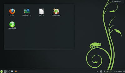
The initial desktop looks like this (click on any picture to view it fullsize):

openSUSE 12.3 - Default KDE Desktop

Some of the things I don't like are:

  • It's too dark with the black background. It looks okay on my desktop, but on my fairly dim laptop screen, it's just too dark.
  • I don't like having a bunch of icons on my desktop. Launchers belong in the task panel or the system menu.
  • Why is the "openSUSE" and "KInfoCenter" icons doing on the desktop? Most people won't be using them regularly, so why have them?
  • The Desktop "tag" in the top-right corner just bugs me.
  • The task panel is too cluttered with a bunch of icons.

1. Remove the floating frame.

openSUSE 12.3 - Removing the floating frame

To get rid of the floating frame, move your mouse over by the right edge and a toolbar will appear. Click the 'x' at the bottom, which I've highlighted in the picture. If the toolbar doesn't appear, then your widgets are locked. Anywhere in the task panel at the bottom, right-click and choose "Unlock widgets".

2. Change the desktop and background.

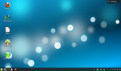
I want the desktop to display the contents of the Desktop folder and I want a lighter background. Right-click on the desktop and choose the bottom option (most likely "Default Desktop Settings"). Under View, change Layout to "Folder View" and click apply. Under Location (it's a new option on the left), make sure that "Show the Desktop folder" is selected.

For the background, go back to View and select a pleasant background. I chose "Air". Click OK.

openSUSE 12.3 - Desktop with Folder View and a lighter background

3. Remove the desktop icons.

Just select and delete all of the desktop icons.

4. Remove unnecessary task panel icons.

Take a look at all of the icons in the task panel:

openSUSE 12.3 - Icons to remove

The first arrow points to the Activities Manager. While this is a cool KDE feature, I never ever use it, so it has to go. Right-click and choose "Remove this Activities".

The second arrow points to the launchers for Dolphin (file manager) and Firefox. These launchers act similarly to "pinning" in Windows 7, where the running program replaces the icon. I've never liked this behavior. I'm going to remove these launchers and then replace them later with quick launch icons, which are just buttons to launch the program. It also happens to be that quick launch icons are larger, which I also like. Right-click on each launcher and select "Remove This Launcher".

Next up are the icons in the system tray. The first one, which looks like scissors, is Klipper. Klipper is a cool program that offers some advanced copy/paste functionality, but like Activities, I never use it, so its going away. Right-click on it, choose "Quit" and then choose "Do not start".

I don't use Bluetooth with my laptop, so I'm going to remove this icon too. You can restore it later from the KDE control panel. Right-click and choose "Configure Bluetooth". Then un-check "Enable KDE Bluetooth Integration". Click "OK".

Finally, let's get rid of Nepomuk. It provides a search index, but again, I never use it, so it's going away. The icon for it isn't visible by default, so click on the up-arrow in the system tray and right-click on "Desktop Search File Indexing" and choose "Configure File Indexing". Un-check "Enable Nepomuk Semantic Desktop" and click "OK". Then go back to the icon, right-click, and choose "Quit" (and then confirm by clicking "Quit" in the new window).

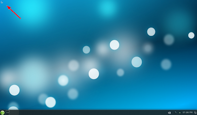
Finally, I want to get rid of that Desktop "tag" in the top-right corner of the screen. Click and drag it to the top-left corner of the screen and it will become much smaller and it's far less likely to be accidentally clicked on if it's over there. I would love to remove it, but I haven't found a way yet.

Your desktop now looks like this:


openSUSE 12.3 - Desktop without unnecessary icons

5. Add in quick launch icons.

Open the system menu and drag down icons for the programs you're going to use the most. I selected Dolphin (file manager), Firefox, and the LibreOffice launcher. In order to get them to drop into the task panel, I had to position the mouse on the left between the green gecko system menu icon and the desktop chooser icon. I think this may be a bug, since you should be able to drop the icons anywhere. Also, I chose the LibreOffice launcher (called just "LibreOffice" in the system menu) instead of the any of the specific LibreOffice program (Writer, Draw, Calc, etc) since the launcher can launch them all.

I also like to add one widget to my desktop - the System Load Viewer. Nothing is more annoying than an unresponsive system and the load viewer allows you to see CPU and memory usage at a glance. If you click to start a program and nothing appears to be happening, the load viewer might show you that the CPU is at 100% indicating that it is indeed loading. Click the golden icon at the right end of the task panel and then click "Add Widgets" in the panel that appears. Search for "System Load Viewer" and double-click it when you see it. Once it's added to your task panel, you'll see it and there will be a green checkmark in the widget panel. Click the golden icon twice to close the widget and configuration panels.

openSUSE 12.3 - Desktop with quick launch icons and the system load viewer

One other tweak: I don't like the icon for LibreOffice. It's too plain, so I'm going to replace it with the one for LibreOffice Writer. Right-click on the icon and choose "Icon Settings". In the window that appears, click on the icon, then search for "Libre" and choose the Writer icon.

openSUSE 12.3 - Desktop with the LibreOffice Writer icon

6.  Rearrange the icons to your liking.

Finally, it's time to place everything where you want it. Click the golden icon at the right end of the task panel to open the configuration panel. With that new panel open, you can drag and drop the icons in the task panel.

I like to have the icons in the following order:

  • System menu (green gecko button)
  • Quick launchers
    • Dolphin
    • LibreOffice
    • Firefox
  • Desktop chooser
  • Task manager
  • System Load Viewer
  • System Tray
  • Clock
 Once you have everything where you want it, right-click on the golden icon and choose "Lock Widgets". This will prevent further (and accidental) changes. If you ever need to make a change, right-click anywhere in the task panel and choose "Unlock Widgets".

7. System menu tweak

One thing that openSUSE has gotten wrong for the last few versions is that the System Menu is just a hair too short and it, by default, requires scrolling on the Favorites tab. One option is to remove an icon from Favorites, but I just like to increase the height a bit. Up in the top-right corner of the menu is place to grab and adjust the size.


There you go, a clean and functional KDE desktop:

openSUSE 12.3 - Desktop with all of the changes


Thursday, March 14, 2013

openSUSE 12.3 is here!

openSUSE 12.3 was released on March 14th and it is awesome. So far, I've installed it on six of my machines and with the exception of one reboot that failed, I have had no problems.

You can grab the ISOs here: http://software.opensuse.org/123/en

I suggest you grab the torrent and download that way. As of right now, there are nearly a thousand seeds for the 64-bit version and a bit over 500 for the 32-bit version, ensuring that your download will be very fast.

The release announcement goes over all of the changes, but some of the ones that I'm excited about are:
  • Version 3.7 of the Kernel
  • PulseAudio 3 (with better Bluetooth audio support)
  • UEFI support (I haven't tested this yet)
  • KDE 4.10, which is getting to be a very nice desktop environment
  • MariaDB (instead of Oracle's MySQL)
They have also released the following introduction to KDE video, which explains a lot of the features and tricks to using KDE effectively. I've been using KDE for around 12 years and even I learned a couple of things that I didn't know already.